AN INTEGRATED COLOUR-CODE FOR MICROTONAL GUITAR FRETBOARDS
Siemen Terpstra
The first time that I visited Ivor Darreg
(in 1981) he was living in Glendale,
California. I was impressed by his amazing array of experimental instruments, but what
grabbed me most was his re-fretted guitars. He had a large collection of them, guitars that
he had carefully altered over the years. There were so many that it was a veritable feast to
me! I had never played re-fretted guitars before, and it was almost overwhelming. Many of
his guitars were pretty trashy - Ivor was not a wealthy man, but his dedication to the
exploration of alternative tunings was quite impressive. A handful of them were pretty
good - I think that I played all of them for a few minutes that unforgettable day. He had
guitars in 19-ET, 22-ET, quarter-tone, 17-ET, and other odd divisions, but the sweetness of
the 31-ET guitar impressed me most. It was also right at the `edge' of the possible, or so it
seemed to me. There were so many frets, so close together, how could you possibly put
more frets on a guitar? Some years later I played a 34-ET guitar, and it largely confirmed
the sentiment. From that day forward, I had an interest in 31-ET guitars.
Although I could `noodle' my way around the fretboard, I soon found that it was
almost impossible to play because I would invariably get lost. What fret am I on, and what
chord is this? I then realized that the problem could be solved if some colour-cocle would
be painted onto the neck for visual guidance. Ivor had a colour-code (rather complex) for
his megalyra steel-guitar, but his `normal' guitars were generally unmarked. On standard
guitars, we generally use an inlay dot at the 5th, 7th, and 12th frets as the `colour-code',
and arguably this is adequate for 12-ET, but 31-ET is so complex (rich) that this traditional
system no longer proves adequate. I began several years of experiment with alternative
colour-codes trying to come up with an optimal design.
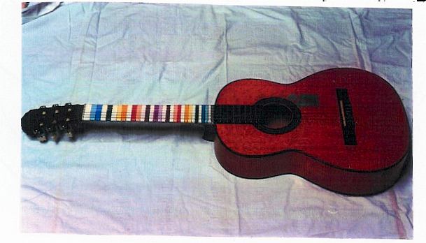
In fact, I caught the `guitar-altering bug' from Ivor, and when I was back in
Canada I acquired a semi-trashy electric guitar which seemed perfect for
`experimentation'. (What is there to lose?) I had never done a guitar fret job before, so I
assumed that the results would be pretty bad. To my surprise, the scale turned out to be
pretty close to accurate, there was only a minimum of `buzzes', and I now had my own
31-ET guitar! At this point, my irnerest in colour-codes intensified. By 1984, I had several
designs which arguably have some consistent logic underlying them. The purpose of this
little article is to lay out the reasons for my chosen design. Here is why I ended up with
this particular pattern.
At first I thought that it really doesn't matter much what pattern I use. As long as I
get accustomed to it by using it over time, it will serve its function. To a certain extent,
this is true, but it does not mean that one pattern is as good as another. Some patterns are
more efficient and `ergonomic' than others. I decided to put some patient effort into
finding an optimal pattern, partly for aesthetic reasons. Such a pattern should fulfill certain
underlying principles of design criteria:
Firstly, frets which are juxtaposed should have maximal colour contrast. In other
words, it is not desirable that two frets next to each other be the same colour. A good
design is one that allows me to play my guitar even in the dark, when I can barely see the
fretboard at all. Good contrast between adjacent frets aids this ability.
Secondly, an optimal design emphasizes those frets which are statistically most in
use. These most important reference points (like the Sth and 7th frets on a 12-ET guitar)
should be bright colours, while the frets which are statistically least used, should be white
(the background colour). White is definitely the best background colour because it also
favours `seeing in the dark'.
Thirdly, there should be only a minimum number of colours on the fretboard.
Needlessly having too many colours adds clutter and complexity which works against
design efficiency. The number of colours should in some manner reflect the inner
architecture of the tuning system itself. An optimal design leaves roughly half of the frets
white so that the `coloured' frets are `surrounded' by the background. Too many white
frets or too few white frets both pose juxtaposition problems and decrease efficiency.
Fourthly, the sequential use of actual colours, like red, orange, yellow, and so on,
should actually embody some `logic' which relates to the musical intervals inherent in the
tuning system. In other words, the lay-out should not be `haphazard' or `random'.
These are the design parameters which drove me to this particular solution.
Granted, some totally different solutions are also possible, but this is the best of the
systems to my judgement. The logic in the colour progression (the rainbow sequence red,
orange, yellow, green, blue, purple) is derived from an isomorphism with the harmonic
series sequence of intervals. Red goes with the perfect fifth and fourth (frets 18 and 13).
The major third and its reciprocal are thus orange. The minor third and its inversion are
yellow. The wholetone and its inversion are green, half tone blue, and the tritone purple.
This progression is aesthetically pleasing because the consonant intervals (fifths, thirds and
sixths) are all `warm' colours (red, orange, yellow) while the dissonant intervals
(wholesteps and so on) are the `cool' colours (green, blue, purple). The octave fret, of
course, is very special, and sits `outside' this colour progression. Instead it is black, in
maximum colour contrast to the surrounding white frets. Ideally, the octave fret (the 31st
fret) also has an inlay-dot, the only fret allowed this `luxury' on the whole fretboard.
Frets in the second octave, of course, repeat the pattern of the first octave, so only or
octave is given in the accompanying table (see the diagram).
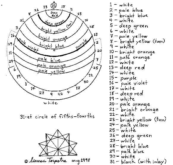
This generalized `colour-interval' sequence was then adapted to the 31-ET system.
Frets 13 and 18, as well as frets 5 and 26 are given `deep' tints, and they stand out very
well from the surrounding white frets. Even if these are the only frets which are coloured,
the fretboard would already be radically improved in its handling. But altogether 12 frets
have `bright colours', and 12 frets are white. This leaves 7 frets which are `soft' or `pale'
(pastel) colours which mediate between the `bright colours' and the `whites'. See the
diagram which shows the frets grouped in a circle of fifths order. This colour grouping
defines the criteria for `most used' and `least used' frets. This grouping of 12, 7, and 12 is
not arbitrary, but based on the harmonic characteristics of 31-ET, which is often described
as a `19 plus 12' system. In fact, the frets which are `bright colours' define the functions in
a traditional meantone chromatic scale. The historical meantone scale was a circle of fifths
between E and G (i.e.
E, B, F.....F, C, G),
the functional scale between II and
IV centered on the key of D. Of course, no key is implied here, only fret numbers, but
the use of 12 `brights' aesthetically integrates this colour-code with traditional meantone harmony.
Note that the fretboard also has inverse symmetry in the colour progression
moving from the 14th fret to the 1st, and the 17th to the 31st. The symmetry would be
perfect but for the 15th and 16th frets. If the symmetry were to be perfect then these two
`tritone' frets should be the same colour (some shade of purple), but this is not desirable.
The decision to make fret 15 `bright' and 16 `pale' (instead of the other way around)
stems again from the desire to integrate the `brights' with the traditional functional
meantone chromatic scale.
Having 12 whites is also perfectly balanced within the system. Some of the
coloured frets are in juxtaposed pairs, such as pale and bright orange, but each pair is
always surrounded by a white fret and forms a pleasing `group'. Increasing the inventory
of white frets damages the balance and needlessly juxtaposes whites, and decreasing the
inventory creates too much colour, also destroying the balance. The equipoise here cannot
be improved upon.
Hence this solution to the `pattern quest' optimally fulfilled all of my design
criteria. I have been using it for many years now, and my appreciation of it has grown over
time. The only weak point I have found in it -my only complaint- has been that the two
necessary shades of yellow are a bit too similar to each other, weakening the principle that
juxtaposed frets should be contrasted. Sometimes, especially in the dark, I would
unintentionally hit the wrong one by mistake. I solved this problem by altering my `bright'
yellow, adding a bit more colour (a bit of brown) so that the contrast with the pale yellow
is enhanced. With this minor modification of the bright yellow toward a `tan' it is well nigh
perfect! I have been quite satisfied with the results, and, since about 1984, I have not felt
any great desire to re-design the colour-code in any radically different manner.
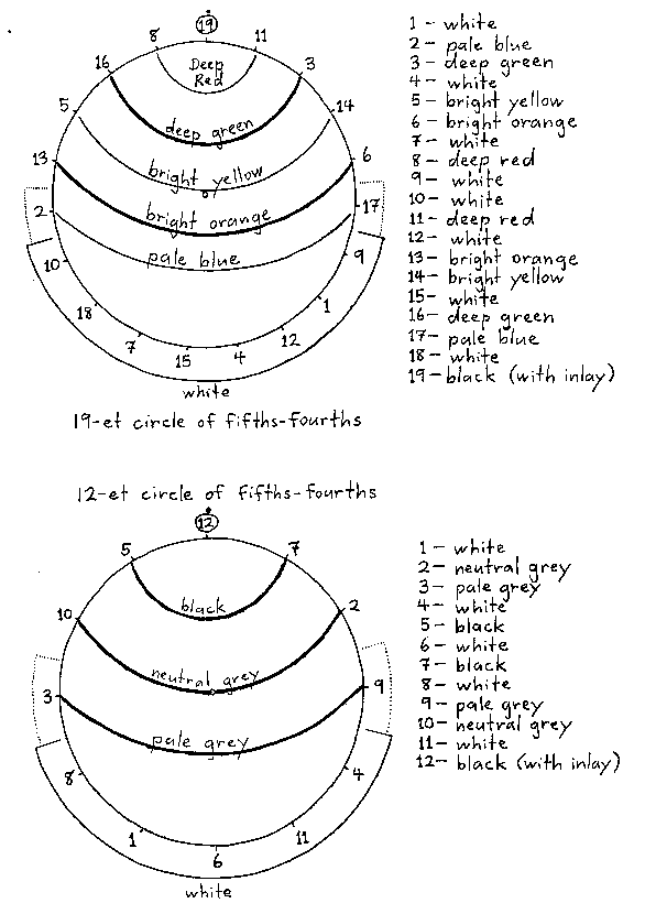
This design approach is also amenable to implementation on different harmony
systems, although each chosen `et' involves some modification of the pattern in order to
integrate it with the structural characteristics of the system. For the purpose of illustrating
this capability, I have included the lay-out for 19-ET and 12-ET, though my main concern in
this article is with the 31-ET system. It can also be applied to 17-ET, 22-ET, and so on. Each
system presents special problems unique to it. I have also adapted the pattern to the 53-ET
system, but decided not to include it in this article. The complexity of the system, and the
explanation of the lay-out would double the length of this article! Anyway, 53 frets per
octave is just not practical by traditional fretting methods.1)
1) I have also worked out an ergonomic colour-code for
53-ET (and just intonation) slide guitars, but I
decided that it also does not belong in this article. Slide guitars have very different requirements - they
have fret-guides rather than actual frets. Consequently, an optimal design, turned out to be very different
from the designs presented here. Laying out my reasons for this alternative design is more properly the
subject of another article in itself.
Looking at the 19-ET fretboard, the modifications are not so extreme. The colour
purple is eliminated altogether. In this case, there are 9 brightly coloured frets, 2 pale
colours, and 8 whites, reflecting the fact that 19-ET is an `11 plus 8' system. The aesthetics
of the pattern is not so successful for 19-ET as it is for 31-ET. Specifically, there is one
juxtaposition of two whites (the tritone frets, 9 and 10). This could not be eliminated
without adding the purple, but then there would be too much colour for this system. Note,
however, that here the pattern has full symmetry around this tritone position. Being the
only such juxtaposition, and in a special place, perhaps it is not so bad. I had one other
complaint. In frets 5 and 6, as well as 13 and 14, we have a juxtaposition of bright yellow
and bright orange. Since there are no `pale' versions of these colours in the system (like in
31-ET) it is perhaps more visually appealing to tone down these colours and make them a
bit less bright, more pastel. This is only a minor complaint, but it shows how the same
colour-code must be `custom' modified to suit each system of harmony.
The application to 12-ET was more successful, if not a bit surprising to many
people. Much of the colour can be eliminated here. All we really need is black, neutral
grey, pale grey, and white. It reflects the fact that 12-ET is a `7 plus 5' system. The fretboard
looks quite impressive. I must admit that the visual appearance of all these fretboards
was also an issue for me - they had to look beautiful as well as being ergonomic.
Some people have said to me: why bother with a colour-code for 12-ET when it is hardly
necessary for such a relatively simple system? This is true, but when I applied it to my
tenor (long-neck) mandolin, I found that it improved my `fast playing' ability noticably.
While the ergonomics may not be so important for 12-ET, they made a huge difference for
31-ET. Without a colour-code, I found the 31-ET finger-board to be extremely difficult.
With the colour-code, the instrument was only slightly more difficult than a `normal' 12-ET
guitar, reflecting the fact that there are more places to put your fingers. Yet even for the
standard 12-ET, the effort was worthwhile.
In fact, I liked the 12-ET solution so much that I decided to try applying the four
colour scheme to the others as well. Is it possibIe to make a workable system for 19-ET a
31-ET using only black (B), neutral grey (N), pale grey (P), and white (W)? Well, the
answer is, yes, although a certain amount of information is lost. The alternative colour
scheme is marked on the diagrams as B, N, P, and W.
First, examine the application to 19-ET. Again, the aesthetics are not quite so
successful as in 12-ET or 31-ET. Specifically, we have two more colourjuxtapositions,
frets 5 and 6, and at frets 13 and 14. Perhaps this is `over the top' concerning
juxtapositions. But the scheme does have a beautifully abstract quality, perfectly tailored
to 19-ET. The distinction between frets 5 and 6 could be made by the use of an inlay on
frets 6 and 14, although it could be argued that this practice puts too many inlays on the
fretboard. As usual, we already have an inlay on the 19th fret (the black, octave fret).
Another alternative is to make frets 6 and 13 pale grey instead of neutral grey. This change
gets rid of the juxtapositions.
The scheme works beautifully with no colour juxtapositions when applied to the
31-ET fretboard. I found the pattern to be quite practical and usable. The traditional 12
notes of the meantone scale now consist of all of the black and neutral grey frets. Of
course, a certain amount of information is lost. Specifically, the colour distinction between
frets 8 and 10, and their complements 21 and 23 has been eliminated. Thus the likelihood
of some confusion between the alternatives is increased. But perhaps this is not such a
high price to pay for the abstract simplicity of using only four colours. As in so many other
areas of design, an improvement in one set of factors has its costs in another set. It cannot
be avoided. At any rate, this is the only sort of modification to the old colour-code which I
have contemplated since the 1980's. Like the other colour-schemes which have been
examined in this article, it is not only practical, but very beautiful to look at.
Only one additional modification has occasionally been found useful over the last
10 years. This was done on a 31-ET `marked' fretless bass guitar. Instead of painting the
pattern directly on the fretboard, it was marked as a strip alang the side of the neck. In
this manner, it is easily visible to the player without the need to paint the top surface itself.
Such an approach can also be applied to ordinary guitars, although here it is not so critical,
and it does not look so beautiful as the `full frontal' treatment. I also used a modification
of this `side' approach together with a different frontal approach to mark my dedicated
`slide' guitar with ratios of 53-ET and Just Intonation. In this way, I could deal with greater
complexity. But this lay-out is another story too complex to pursue here.
I am sharing this information so that others may try it out, or be stimulated to
come up with their own alternative colour-codes. Perhaps you have a favourite guitar that
could be `dressed up' to your advantage. In closing, let me relate my reaction to people
who have asked me: why have you painted your frets all of these colours? Instead of
explaining all the ergonomic factors presented in this article, I sometimes just wax poetic
and say: the colours in the frets are just a reflection of the colours in the harmony system.
 and G
and G (i.e.
E
(i.e.
E